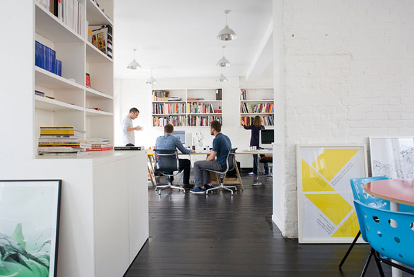
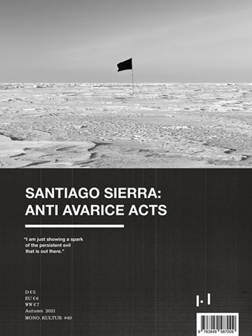
 We’d been wanting to work with London’s Studio8 for quite some time but never quite dared to ask – after all, they’d ascended into the top league of editorial design a few years ago, with titles such as our favourite Port magazine (which they co-publish) or the indispensable illustration/design bible Elephant to their name, and contributing to the redesign of The New York Times Magazine or The New Yorker. But when our current issue with Chris Ware finally was ready for production, we summoned our courage and dropped a polite email to Studio8’s co-founder Matt Willey, who, luckily for us, instantly said yes.
And we couldn’t have thought of a studio more appropriate for Chris Ware’s unique style drawing, with Studio8’s trademark elements all firmly in place: illustrative typography, a sensibility for paper and materials, a thoughtful approach to the magazine as object, and a playful sense of humour. It was a wonderful and easygoing collaboration – let’s do it again soon!
