 Restraint can be a tricky thing sometimes when it comes to design, especially when you have to capture someone like Spanish architect Ricardo Bofill, with more than 30 years of a turbulent career and over a hundred built projects in just about as many styles to his name.
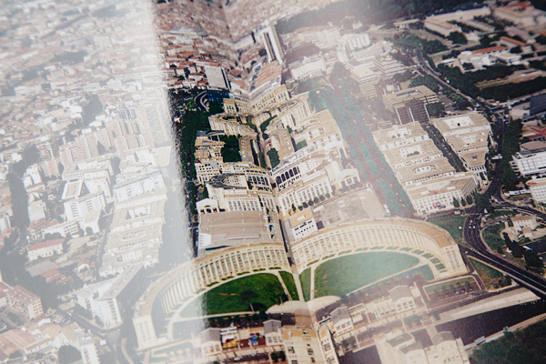
For our current issue mono.kultur #36, we had the unique opportunity to have access to Bofill’s archives, with literally hundreds of images that had never been published before, so it was obvious to us to treat the issue as a sort of visual rollercoaster ride through the many little quirks and spleens of Bofill’s architectural oeuvre, zooming in on details, creating unexpected pairings and cross references, without any explanation whatsoever.
So what about those naked frolicking bodies that illustrate the text, you ask? These are stills from some experimental films that Bofill made in the 1970s, and felt so appropriate for the decadence and grandeur surrounding the Bofill clan; architecture often feels like such a sterile profession devoid of any sexuality, and if anyone has an antidote to that particular predicament, then it must be Ricardo Bofill.
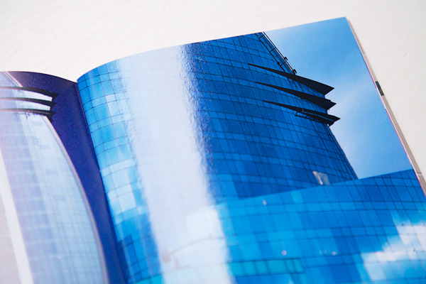
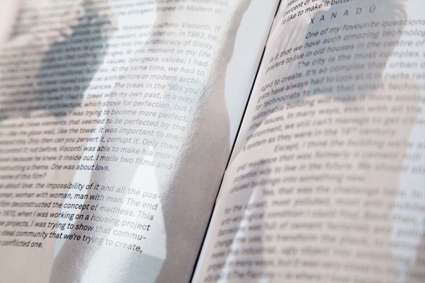
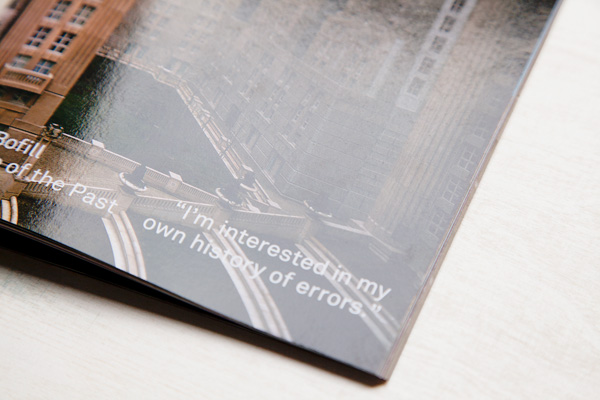
Bofill’s career undertook a sharp turn in the 1990s, when he started working with steel and glass, materials he had dismissed before; similarly, his office began building more corporate environments: hotels, airports, company headquarters, in addition to the social housing projects he had become famous with. Our designers John McCusker and Vela Arbutina reflected this shift beautifully by incorporating high varnish gloss throughout the issue, but one only one of the pages of a spread, bringing together elegantly the wild diversity of the images while creating a clash between glossy and earthy, a suitable contrast of materials that is so significant to Bofill’s work. It makes for a striking effect that brings the entire issue together – and sometimes it is as simple as that.
