We’re about to go to print with our forthcoming summer issue, but that should not stop us from saying a few more words about the ideas that went into the design of our still current, still beautiful issue mono.kultur #40 with British ceramicist and artist Edmund de Waal.
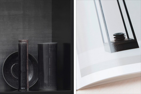
De Waal is a potter, and anyone familiar with his work will know a little about the extraordinary amount of attention that goes into every detail of his objects – intellectually and physically. While keeping a seemingly simple appearance, the closer you come to his work, the more complex and intriguing it becomes.
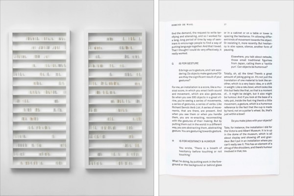
Similarly, our issue is a play on texture and finishing that is directly inspired by the tactility of porcellain, before and after glazing, by using a smooth matt coated paper that is coated with a super glossy varnish on every other spread – setting off the words against the accompanying images with a subtle touch of the fingertips.
Visually, the issue is an exercise in restraint and elegant modernism – our house font Akkurat all the way through in the same cut and weight – as proposed by the lovely team at Danish design studio Designbolaget, who are not afraid of following the maxime ‘less is more’ all the way to the end. Needless to say, it allows for plenty of white space to breathe, as it should when you have an interview titled W is for White.


