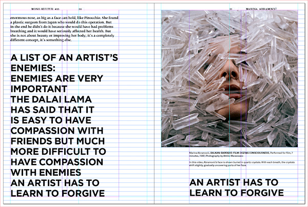
 We were obviously going to talk about this some time ago (and where did that time go again?), but then it’s never too late to talk about design, nor about Marina Abramović. So this is what we were thinking when we immersed ourselves deep into the complex worlds of Marina and trying to translate those into print:
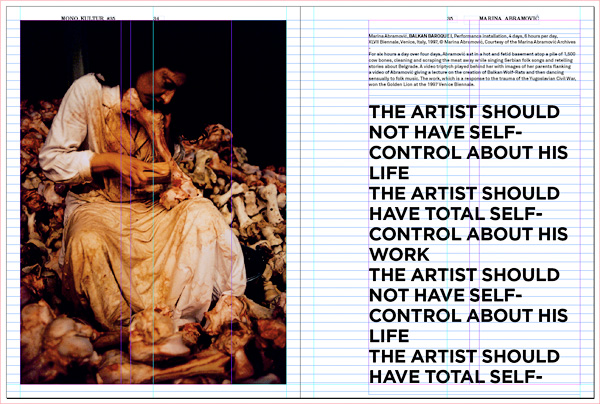
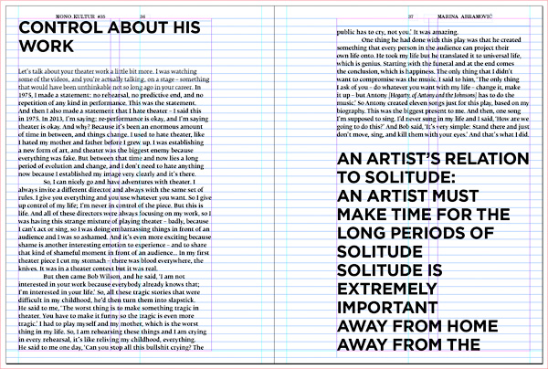
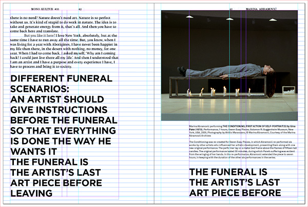
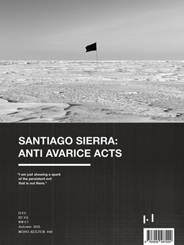
While our previous issue with Brian Eno had been somewhat of a colour explosion on paper, our issue #35 was an exercise in restraint and discipline. Designed by our Israeli friends Nirit Binyamini and Gila Kaplan, who had already penned a few issues for us, we approached the issue the same way as Marina Abramović would approach a performance: give yourself a set of rules, fill with content, give up control. In our case, the rules were a set of different grids, font sizes, and structural decisions for each of the issue’s elements: images, captions, headlines, interview. These were then played out without mercy, no matter if they complimented each other or not, if they led to funny page breaks or odd positionings – all the things any decent designer would normally spend many hours trying to work a way around. Starting on the cover page and working its relentless way to he inside back cover, we just let the system run its course – just like Marina would. Sounds easy, but of course it never is.
A particular pleasure, of course, was the image material – a personal selection by Marina of works that she regards as the most important in her career. With the interview focusing on the recent years of her revival since the MoMA retrospective, the images and projects provided a nice timeline and background to get a better understanding of the present. And it was a little surprising to see that her works of the 1970s are just as shocking today as they must have been back then.
